
What Makes a Book Cover Feel Timeless?
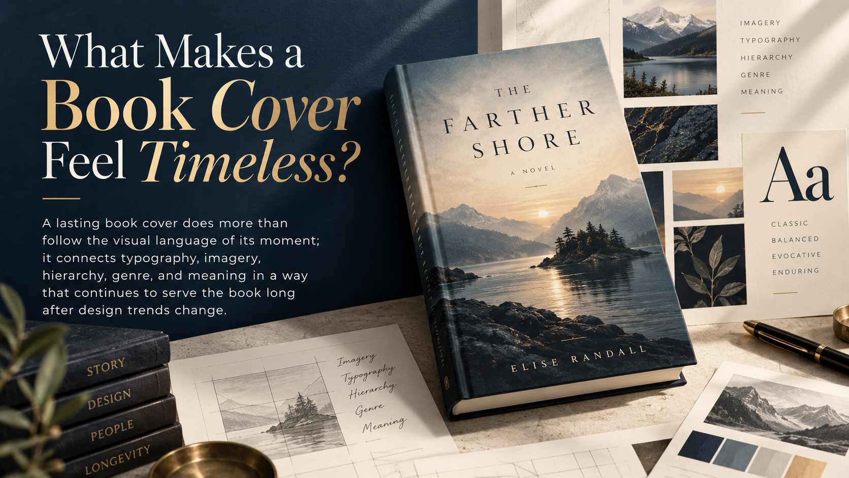
A lasting book cover does more than follow the visual language of its moment; it connects typography, imagery, hierarchy, genre, and meaning in a way that continues to serve the book long after design trends change.
Some book covers reveal their age almost instantly. The typography belongs to a particular decade. The imagery echoes a once-popular trend. A color treatment that once looked contemporary now feels unmistakably tied to its moment.
Other covers age differently.
They may reflect the design traditions of the period in which they were created, yet they continue to look considered, purposeful, and appropriate to the books they represent. That quality is often described as timelessness.
Timeless, however, does not mean visually neutral. A lasting cover can be ornate or restrained, historical or contemporary, illustrative or typographic. What matters is that its decisions have reasons deeper than fashion.
The most durable book covers tend to understand the manuscript, communicate clearly with the intended reader, establish hierarchy, and develop an identity specific enough to belong to one book rather than an entire publishing season.
That is where timeless cover design begins.
Timelessness Starts With an Idea, Not an Aesthetic
A cover designer can begin with color, typography, photography, illustration, archival material, or abstraction. But beneath those choices there should be a concept.
The University of California Press describes successful cover design as something that connects conceptually to the content of the book. Its designers consider the manuscript, audience, genre conventions, imagery, typography, historical context, and legibility together rather than treating the cover as an independent decoration.
Penguin Random House offers a useful example in its discussion of the cover development for Soon Wiley’s When We Fell Apart. The editorial and design teams began with the novel’s central mystery, setting, themes, tone, and manuscript itself. Designer Dominique Jones reread the book, extracted ideas from the text, explored multiple visual directions, and eventually developed a design around duality, identity, emotion, and the contrast between different worlds.
The lesson is significant.
A fashionable treatment can make almost any book look current. A strong concept explains why this particular book should look this particular way.
Imagine two memoir covers.
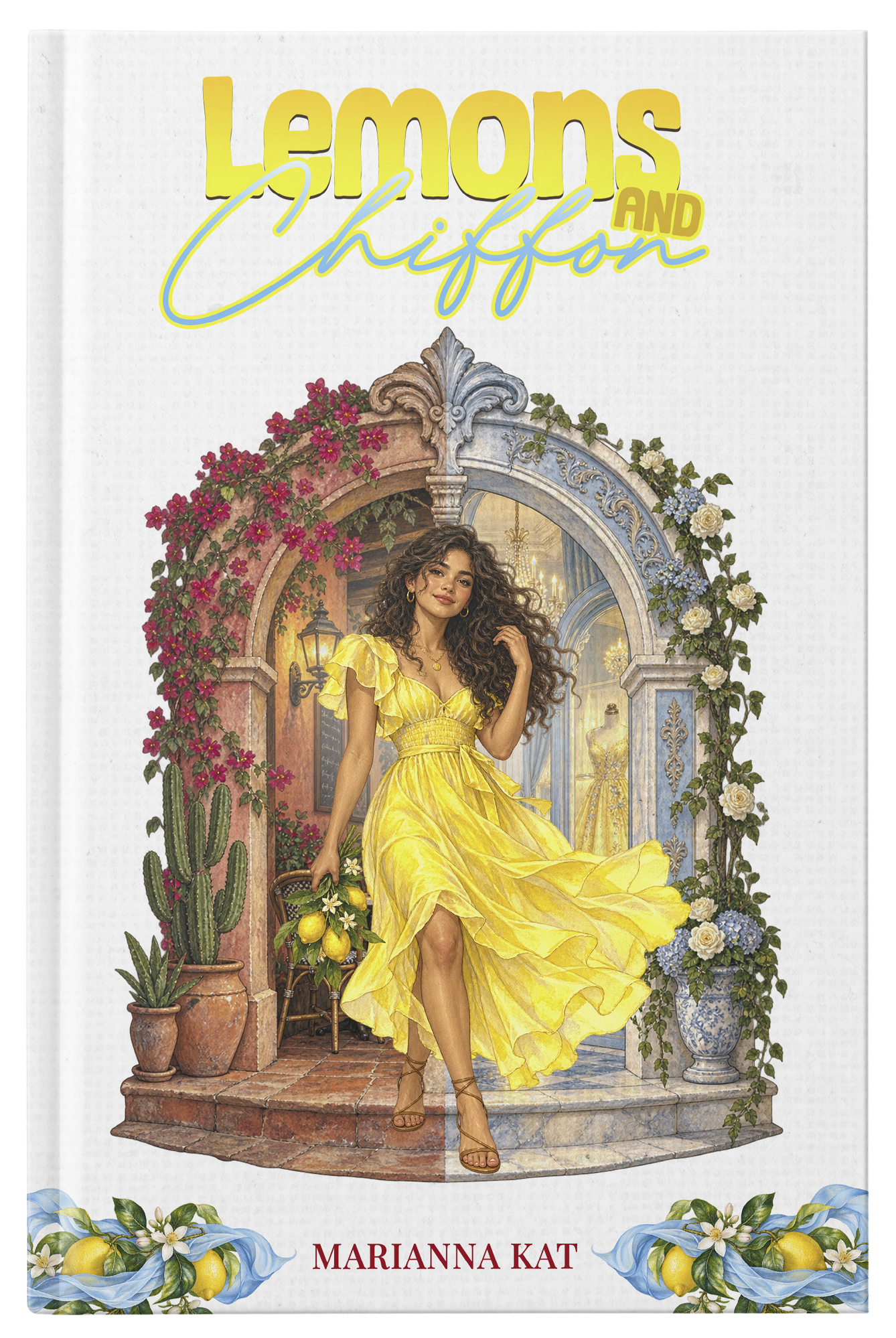
One uses a generic portrait, decorative script, and a current color palette because those elements appear frequently in the category. The second identifies a recurring object, place, or visual tension from the memoir and turns it into the central design idea.
Both may initially look attractive. The second has a stronger chance of retaining meaning because its identity comes from the manuscript rather than from the marketplace alone.
The cover does not need to explain the entire book. It needs a compelling reason for its visual choices.
Typography Should Belong to the Book
Typography is sometimes treated as the final layer placed over an image. On strong covers, it is part of the architecture.
Type establishes hierarchy. It affects tone. It can suggest seriousness, intimacy, urgency, elegance, wit, authority, historical period, or genre before a reader consciously processes the words.
UC Press designer Kevin Barrett Kane has discussed choosing typography according to factors including cultural and historical relevance, aesthetic character, the actual shape and length of the title, and legibility.
That final consideration is particularly important because contemporary covers are encountered at dramatically different scales.
A reader may first see a book as a printed hardcover in a bookstore. Another reader may discover exactly the same cover as an image only a few centimeters tall on a phone.
A typographic treatment that works beautifully at full size but becomes unreadable when reduced has lost part of its publishing function.
This does not require enormous titles on every book. Nor does timeless typography mean defaulting to a small group of supposedly “classic” typefaces.
The better questions are more specific:
Does the type support the mood and subject of the book?
Does the hierarchy remain understandable when the cover is reduced?
Does the typography compete with the image or collaborate with it?
Would the type still make sense if the current fashion surrounding it disappeared?
A typeface can be fashionable and still be appropriate. The risk appears when trend recognition is doing more work than the underlying design.
Visual Hierarchy Gives a Cover Longevity
One of the easiest ways for a cover to feel dated is for everything to demand attention at once.
Title. Subtitle. Author. Series line. Endorsement. Award information. Illustration. Promotional copy.
Every element may be legitimate, but they cannot all occupy the same visual level.
Strong cover design establishes an order for the eye.
A reader should be able to understand, often almost instinctively, where to look first and what to notice next. This remains true whether the cover is minimalist or densely illustrated.
That distinction matters because restraint is frequently mistaken for minimalism.
A cover does not need vast empty spaces to feel enduring. Margaret Armstrong’s celebrated book bindings from the late nineteenth and early twentieth centuries, preserved in the Library of Congress, could be richly decorative. Her work combined botanical motifs, custom lettering, borders, contrasting colors, and metallic stamping, yet the elements were organized within a deliberate visual system.
The Library of Congress notes that Armstrong became known for distinctive lettering and the integration of type and image. Her work demonstrates that ornament and clarity are not opposites.
Timelessness therefore should not be reduced to “use fewer things.”
A better principle is: make every element know its role.
Genre Recognition Matters, but Imitation Ages Quickly
Book buyers read covers visually before they read them literally.
Certain combinations of imagery, type, composition, and color develop associations with particular categories. A cover can signal romance, literary fiction, thriller, business, history, fantasy, memoir, or children’s publishing before the reader studies the description.
These signals have commercial value.
IngramSpark’s current guidance on cover design emphasizes understanding the book’s genre, audience, and positioning. Its discussion of enduring cover styles also notes that visual trends change and that an off-genre or dated-looking cover can affect how readers initially perceive a book.
The difficulty is knowing how closely to follow what already exists.
If a successful novel creates a distinctive visual language, similar books often appear soon afterward. A particular illustration style spreads. Titles become larger. Certain colors dominate. One photographic device begins appearing repeatedly.
For a time, those signals can be commercially useful.
Eventually, they may identify a publishing moment more strongly than an individual book.
A more durable cover understands why a genre convention works.
A thriller may use sharp contrast because tension and immediacy matter.
Literary fiction may tolerate abstraction because interpretation is part of the reading promise.
Practical nonfiction may depend heavily on typography because subject clarity and authority need to be communicated quickly.
Historical fiction may use period references to establish setting, but it does not necessarily need to imitate an artifact from that period.
Understanding the function of a convention allows a designer to adapt it rather than copy it.
That produces a valuable balance: the book feels recognizable to the right reader without becoming visually interchangeable with its competitors.
The Best Imagery Often Leaves Something Unsaid
Literal cover design can be effective, but literalism has limits.
Suppose a novel contains a lighthouse, an old house, a family secret, a storm, and a protagonist returning to her hometown. Putting all five elements on the cover may accurately inventory the plot, but accuracy alone does not create visual interest.
A cover has a different task.
It can suggest atmosphere.
It can introduce a contradiction.
It can use a recurring object symbolically.
It can reveal something about the book only after the reader finishes the story.
This is one reason strong covers often become more meaningful after the book has been read.
Penguin Random House’s documentation of its design process repeatedly shows designers moving beyond straightforward plot illustration. In the development of When We Fell Apart, the team explored photography, illustration, hand lettering, scenery, relationships, and visual metaphor before finding the final direction.
A separate Penguin Random House case study for Robert Jones Jr.’s The Prophets describes experiments with landscape, characters, blackbirds, silhouettes, hand lettering, color, and negative space in an effort to represent the scale and emotional character of the novel rather than merely illustrate a scene.
The strongest cover image is therefore not necessarily the image that tells readers the most.
It may be the image that gives them the most compelling reason to look again.
A Cover Can Reflect Its Era Without Being Trapped by It
There is no single visual style called “timeless.”
Book-cover history makes that clear.
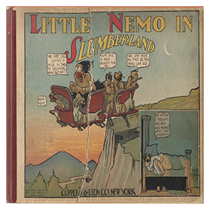
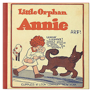
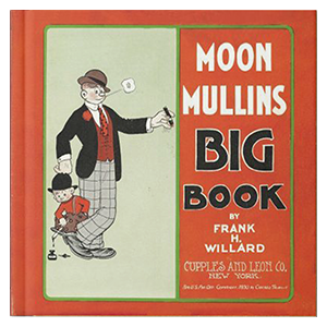
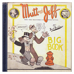
During the late nineteenth century, decorated cloth bindings could function as important selling features. The Library of Congress records how publishers hired artists such as Margaret Armstrong as decorative book covers became increasingly important to the appearance and marketability of books. By the early twentieth century, printed dust jackets increasingly assumed the decorative role previously performed by the binding itself.
The physical object changed.
Printing methods changed.
Retail environments changed.
Graphic-design movements changed.
Today, digital bookselling has created another change: the cover must frequently function before the reader ever handles the book.
None of this means designers should try to remove all evidence of the period in which they work.
Doing so can produce a different problem: a design without enough personality to belong anywhere.
A cover can use contemporary typography, illustration, photography, or composition and still have longevity if those choices remain appropriate to the book.
The more useful question is not, “Will this look modern in ten years?”
No designer can reliably guarantee that.
Ask instead:
If this visual treatment stops being fashionable, will the underlying idea still make sense?
That is a more practical definition of durability.
The Thumbnail Has Changed the Design Test
Historically, a book cover was primarily designed for a physical object.
That physical role still matters, but the first encounter increasingly occurs in digital environments.
This creates a demanding design test.
Reduce the cover dramatically.
What remains?
The smallest subtitle may disappear. Fine textures may become invisible. Complex photographic details merge. Delicate lettering may lose distinction.
A well-structured cover still retains something identifiable: a title shape, dominant image, recognizable contrast, or distinctive compositional gesture.
This is not simply an aesthetic preference. Digital retailers impose specific technical requirements on cover files.
Amazon KDP’s current eBook guidance specifies an ideal marketing-cover dimension of 2,560 pixels high by 1,600 pixels wide, identifies accepted formats, and requires publishers to possess the necessary rights to the cover content.
Print introduces different requirements. KDP’s paperback specifications require, among other things, appropriate bleed, embedded fonts, flattened content, safe placement of essential elements, and images of at least 300 DPI.
IngramSpark’s current print-cover specifications similarly address PDF preparation, 300 ppi resolution, CMYK color, bleed, and type-safety areas.
Technical compliance does not create timeless design.
It does protect good design from poor reproduction.
The best visual concept can still fail as a publishing asset if the text is cut by trimming, images reproduce poorly, fonts are mishandled, or important material falls outside safe production areas.
Details Should Reward the Physical Reader
The thumbnail test should not force every cover toward simplification.
Print offers possibilities that a small digital image cannot reproduce: paper texture, cloth, embossing, foil, debossing, spot treatments, subtle illustration, edge treatments, tactile contrast, and details visible only at close range.
A sophisticated contemporary cover can therefore operate at two levels.
At small scale, the identity survives.
At physical scale, the object rewards attention.
That dual function may actually support longevity. The design has a strong enough structural idea to survive reduction while retaining enough craft to remain interesting when held.
This also helps explain why some historical book designs remain compelling. Their printing technologies may belong unmistakably to another period, yet the relationship between material, lettering, ornament, and composition still feels deliberate.
The technology has aged.
The design intelligence has not.
Trends Are Tools, Not Strategies
It is unnecessary to reject trends simply because they are trends.
Publishing is a visual culture. Designers respond to contemporary illustration, type design, photography, fashion, film, advertising, art, and other books.
Trends can make a cover feel relevant to its intended readership.
They can also provide useful shorthand.
IngramSpark’s 2025 discussion of book-cover styles that “stand the test of time” explicitly acknowledges the changing nature of visual fashion while identifying approaches such as strong typography that can continue working across genres and trend cycles.
The mistake is allowing a trend to become the entire concept.
A useful test is to imagine removing the fashionable device.
Would there still be a meaningful relationship between the design and the manuscript?
Would the hierarchy remain strong?
Would the cover still communicate its category?
Would it still possess an identity?
If the answer is yes, the trend is probably serving the design.
If the answer is no, the design may be serving the trend.
A Book Designer’s Perspective
A successful cover usually has to solve two problems simultaneously:
What kind of book is this? What makes this book different from the others around it?
The first question concerns positioning. The second concerns identity.
A design that answers only the first may be commercially understandable but generic. One that answers only the second may be original but misleading.
Professional cover development tries to reconcile them.
That is why author feedback is most useful when it addresses communication rather than personal preference.
“I don’t like orange” tells a designer something about taste.
“The cover currently makes the novel appear comic, but the manuscript is psychologically dark” identifies a positioning problem.
“The figure looks too young for the protagonist” identifies a representational problem.
“The title disappears when I look at the cover at thumbnail size” identifies a hierarchy problem.
The distinction matters because professional book design is not simply the process of producing an image the author likes. It is the process of building an appropriate visual interface between a manuscript and its potential reader.
Our Modern Books








Contact form
KEY
TAKEAWAYS
Timelessness comes from relevance to the book.
Typography needs a purpose.
Genre conventions should inform rather than dictate.
Strong imagery does not need to explain everything.
Production quality still matters.
FINAL THOUGHTS
A timeless book cover is not a cover that appears to have been designed outside history.
Many enduring covers reveal exactly when and how they were made.
What keeps them alive is something else: conviction.
Their type, image, color, proportion, and material treatment feel connected by an idea strong enough to outlast the fashion surrounding it.
That is a more useful goal for authors and designers than trying to predict which visual style will remain fashionable ten or twenty years from now.
Understand the manuscript deeply. Understand the reader. Respect the visual expectations of the category without surrendering to them. Build a hierarchy that survives reduction. Remove decisions that exist only because other successful books currently use them.
A cover does not need to escape its time.
It needs enough identity to survive it.