



How Professional Interior Book Design Improves the Reading Experience
Professional interior design turns a manuscript into a readable physical or digital system, using typography, spacing, hierarchy, navigation, and production choices to help readers move through the book with less friction.
Readers notice a beautiful cover before opening a book. Good interior design works differently.
Ideally, much of it disappears.
A reader does not want to stop midway through a novel to admire the gutter margin. Someone consulting a business book should not have to decode an inconsistent heading system. A memoir should not become tiring because lines are crowded together, and an eBook should not break simply because a reader enlarges the type.
Interior book design is the system that prevents those interruptions.
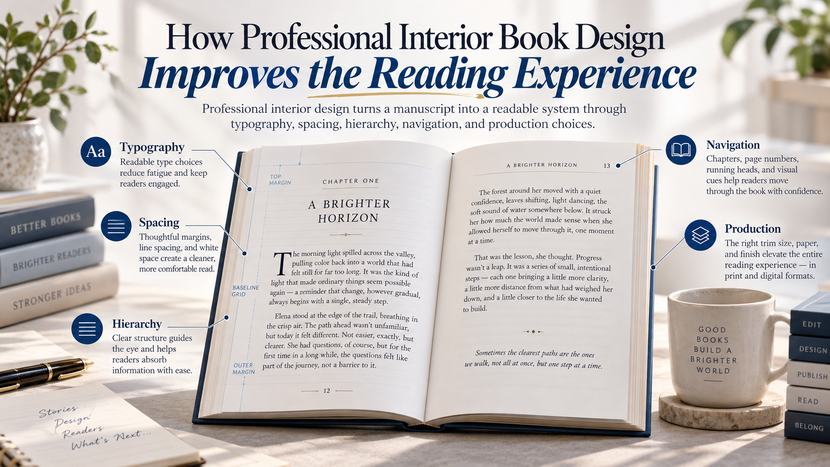
It determines the relationship among page size, typography, line length, margins, spacing, chapter openings, running heads, page numbers, images, tables, front matter, and other elements. For digital editions, it also affects reflow, navigation and accessibility.
The strongest interiors do more than look professional. They make the act of reading feel natural.
That is why typesetting should be treated as part of the reading experience rather than as decoration applied after the manuscript is finished.
Interior Design Creates the Architecture of the Page
A manuscript is primarily an editorial document. A finished book is a reading environment.
The difference is significant.
A manuscript may contain chapter headings, paragraphs, quotations, lists, images, tables, notes and page breaks, but those elements have not necessarily been designed as a unified system. Interior design establishes the relationships between them.
For a print book, the designer must consider:
- trim size;
- typeface and type size;
- line length;
- leading, or line spacing;
- paragraph treatment;
- margins and gutter;
- chapter openings;
- running heads;
- folios, or page numbers;
- section hierarchy;
- widows and orphans;
- images and captions;
- tables and figures;
- front and back matter; and
- page-to-page visual rhythm.
These decisions interact.
Change the trim size and the line length changes. Change the font size and the page count may change. Change the page count and the required inner margin may change because thicker books need additional space near the binding.
Amazon KDP’s current print guidance illustrates this relationship clearly. Its minimum inside-margin requirements increase as page count increases, while its formatting instructions separately account for trim size, margins, bleed, chapter structure, pagination, headers and images.
Interior design therefore cannot be reduced to choosing an attractive font.
A page is a system.
Typography Should Support Reading Before It Expresses Style
Typography gives a book much of its personality, but personality is only part of the job.
Body type has to withstand repetition.
A decorative typeface may look appealing in a chapter heading because the reader encounters it briefly. The same typeface could become exhausting across 80,000 words.
Professional designers therefore distinguish between display typography and reading typography.
Display type can carry stronger visual character.
Body type generally requires greater restraint.
The familiar argument that serif fonts are automatically superior for print and sans serif fonts automatically superior for screens is also too simplistic. A controlled study comparing Times New Roman and Helvetica in paperback-style layouts found no significant difference in reading speed between the serif and sans serif conditions. Other research has likewise shown that actual letter size, spacing and typeface characteristics interact in more complicated ways than the serif-versus-sans-serif rule suggests.
That does not mean typeface selection is irrelevant.
It means a designer should evaluate the complete typographic system:
Does the type remain clear at the chosen size?
Are similar characters distinguishable?
Does the weight reproduce well on the selected paper?
Does the x-height suit the intended size?
Is the line spacing appropriate?
Does the font contain the necessary punctuation, symbols and language characters?
Does it complement the tone of the book without competing with it?
Research in vision science reinforces the importance of size. A review of print-size research identifies character size as a major factor in legibility, while a separate study involving readers with mild to moderate vision loss found reading speed improved as print size increased across the tested range.
There is no single ideal point size for every book because fonts differ physically even when assigned the same nominal size.
Professional typography is therefore judged by how the type actually reads on the finished page, not by a number selected in isolation.
Margins and Line Length Affect Physical Comfort
Margins are frequently misunderstood as empty space that could have been used for more text.
They perform several jobs.
They frame the text block, give the page visual proportion, keep content away from trimming tolerances and, most importantly, prevent text from disappearing uncomfortably into the binding.
IngramSpark’s current May 2026 File Creation Guide recommends a 0.5-inch margin for black-and-white interiors and specifies that headers, footers, page numbers, body text and non-bleeding images remain within that safe area. Amazon KDP uses minimum margins that vary according to page count and bleed configuration.
Those figures are manufacturing requirements, not a complete design prescription.
A professional designer may use more generous margins because a page that technically passes a printer’s validation can still feel cramped.
The gutter deserves particular attention.
If text sits too close to the binding, readers may have to force the book open to read the ends of lines. IngramSpark’s interior-design guidance specifically notes that inadequate inner margins can interrupt reading because text becomes difficult to access near the bind.
Line length also changes with page geometry.
Very long lines force the eye to travel farther and relocate the beginning of the next line. Very short lines create frequent returns and can produce awkward word spacing or excessive hyphenation.
Digital accessibility guidance provides a useful general reference point rather than a rigid book-design rule. W3C’s WCAG visual-presentation guidance provides a mechanism for keeping blocks of text to no more than 80 characters or glyphs per line, while the U.S. National Center for Biotechnology Information’s design standard recommends a maximum of approximately 75 characters for comfortable on-screen reading.
Printed books are different environments and should not mechanically inherit web measurements. The broader principle still holds: line length should be intentionally controlled rather than allowed to emerge accidentally from trim size and font selection.
Hierarchy Helps Readers Understand Where They Are
A well-designed book communicates structure before the reader consciously analyzes it.
A part title looks different from a chapter title.
A primary heading does not look identical to a secondary heading.
A quotation is distinguishable from body text.
A caption clearly belongs to an image.
A sidebar feels separate without appearing unrelated.
That is visual hierarchy.
In fiction, hierarchy may be relatively quiet. The principal signals might consist of chapter numbers, scene breaks, section ornaments and occasional special text.
Complex nonfiction may require a much more developed system involving:
- part openers;
- chapter headings;
- multiple heading levels;
- numbered steps;
- bullet lists;
- tables;
- figures;
- captions;
- sidebars;
- exercises;
- pull quotations; and
- notes.
The reader should be able to infer the relationship among these components visually.
If Heading Level 2 appears bold on one page, italic on another and all-capitals later, the page begins requiring interpretation that should have been handled by the design system.
Consistency reduces that cognitive burden.
It also helps the book feel intentional.
Navigation Is Part of the Reading Experience
Readers do more than read forward.
They return to earlier chapters, locate references, search for sections, compare illustrations, consult notes and move between the table of contents and the main text.
Interior design should support those behaviors.
In print, navigation can be strengthened through:
- logical page numbering;
- accurate tables of contents;
- running heads;
- section dividers;
- clear chapter openings;
- indexes where appropriate; and
- consistent placement of reference material.
Digital books introduce different requirements.
Amazon requires Kindle eBooks with chapters or sections to contain a working logical table of contents. It also strongly recommends an HTML table of contents because readers expect easy access to sections and because some older reading environments depend on it.
Navigation is therefore not administrative housekeeping.
It affects whether readers can successfully use the book.
This matters especially for reference works, textbooks, business books, cookbooks, devotional books, guides and other titles readers may consult nonlinearly.
The Interior Should Reflect the Kind of Book
Professional design is not a universal template.
A novel and a cookbook should not necessarily solve the page in the same way.
Fiction
Most novels benefit from typography that stays out of the way. Decorative elements are usually concentrated around chapter openings, part pages or scene breaks while body pages remain comparatively restrained.
Memoir
Memoir may borrow the continuity of fiction but can require additional hierarchy for photographs, letters, diary extracts, timelines or archival material.
Business and Practical Nonfiction
These books frequently need clearer navigation. Headings, numbered frameworks, lists, diagrams, exercises and callout material may be central to comprehension.
Academic or Reference-Oriented Work
Footnotes, endnotes, citations, bibliographies, tables and cross-references require rigorous consistency. Page space must accommodate information density without becoming visually exhausting.
Children’s and Illustrated Books
Here, images and text may be inseparable. Page turns, visual sequencing, text placement and image composition may carry narrative meaning.
Poetry
Line breaks may be part of the work itself, making trim size, page width and typography particularly sensitive choices.
The purpose of professional interior design is therefore not to give every manuscript a “premium” appearance.
It is to design the format that best supports the way that particular book needs to be read
Images and Tables Must Be Designed, Not Merely Inserted
Visual material creates another layer of complexity.
A photograph should have enough resolution to reproduce cleanly.
A caption needs a consistent relationship with its image.
A table must remain readable without forcing type to become too small.
Figures need predictable labels and placement.
Full-bleed material requires technical allowances beyond the final trim.
Current KDP print specifications require interior images to be at least 300 DPI and require files containing bleed to extend content 0.125 inch beyond the top, bottom and outside trim edges. IngramSpark’s May 2026 guidance similarly requires bleed preparation and recommends high-resolution images for reliable reproduction.
But technical compliance is only the beginning.
A 300-DPI image can still be badly positioned.
A perfectly printable table can still be impossible to understand.
The designer must decide how visual information relates to the surrounding reading flow.
Readers should not repeatedly hunt several pages backward to find the image being discussed. Captions should not become detached from figures. Tables should not be compressed simply to preserve a predetermined page count.
Interior design reconciles content with physical constraints.
Print and eBook Interiors Should Not Be Treated as the Same File
One of the clearest signs of weak digital production is an eBook that tries to behave exactly like a printed page.
Most text-heavy Kindle books are reflowable. Amazon describes reflowable books as content that adjusts when readers change text settings. Readers may modify type size and other display characteristics, and reflowable formats can support features including dictionaries, text-to-speech where available and customizable presentation.
That flexibility is part of the digital reading experience.
A print book can depend on exact page positions:
“See the chart opposite.”
“The quotation appears at the top of page 143.”
A reflowable eBook cannot safely assume the same geometry because page composition changes with device dimensions and reader settings.
Digital interior design therefore depends less on fixed positioning and more on structure.
Headings need correct hierarchy.
Paragraphs must respond properly to resizing.
Images should scale appropriately.
Links and notes must work.
Tables should remain usable.
Navigation must be functional.
Fixed-layout eBooks are appropriate when page composition itself is essential, but Amazon notes that reflowable text allows readers to resize the type and adapt the book to different screen sizes.
The correct format should be chosen according to the content rather than because one format appears more visually controlled.
Accessibility Is Now Part of Professional Digital Design
Interior design also determines who can successfully read the book.
Amazon’s current eBook accessibility guidance states that meaningful images should include textual alternatives so readers using assistive technologies can access the information. It recommends real text rather than images of text wherever possible and specifies alternative text for meaningful images.
Amazon also notes that reflowable Kindle books can support screen readers and refreshable braille displays when the reading device or application provides those capabilities.
The broader accessibility principle is adaptability.
W3C’s current WCAG 2.2 guidance requires digital content to survive changes in text spacing without losing information or functionality and emphasizes reflow so enlarged text does not force readers to scroll horizontally line by line.
A professional eBook should therefore resist unnecessary fixed dimensions that break when readers adjust the presentation.
This is an important philosophical difference between print and digital design.
In print, the designer controls the page.
In a reflowable eBook, good design intentionally gives some of that control back to the reader.
Professional Design Includes Production Quality Control
A beautiful layout is not finished until it has survived proofing.
Print platforms impose technical requirements because small file problems can become physical manufacturing problems.
KDP currently requires embedded fonts, single-page rather than spread-format interior files, appropriate margins, minimum image resolution, and correctly prepared bleed. IngramSpark also requires single-page PDFs, embedded fonts, margin safety and bleed preparation for applicable elements.
Professional proofing goes further.
A designer should check for:
- stranded headings;
- accidental blank pages;
- incorrect running heads;
- missing or duplicated page numbers;
- widows and orphans;
- awkward hyphenation;
- inconsistent paragraph indents;
- broken tables;
- low-resolution graphics;
- incorrect image placement;
- inaccurate table-of-contents entries;
- excessive blank space;
- unexpected font substitution; and
- page elements that sit too close to trimming or binding areas.
Amazon encourages authors to preview uploaded interiors and order proof copies before publication.
A physical proof can reveal problems that are easy to overlook on a monitor.
The gutter behaves differently in a bound object.
Paper changes contrast.
A typeface that looked comfortably sized at 150 percent screen zoom may suddenly feel small in print.
The object itself has to be evaluated.
From the Book Designer’s Desk
The strongest interior design is often the design a reader talks about least.
That is not because it lacks personality.
It is because the personality belongs to the book rather than interrupting it.
A novel does not become more professional because every chapter contains an elaborate ornament. A nonfiction book does not become clearer because every paragraph has a colored callout box. A narrow margin does not become efficient simply because it reduces the page count.
Every visible choice carries a cost.
Decoration competes for attention.
Density creates fatigue.
Excessive variation weakens hierarchy.
Too much white space can fragment continuity.
Too little creates pressure.
Professional book design works by balancing those forces.
The designer’s real task is to ask, page after page:
What does the reader need here?
Sometimes the answer is a visual intervention.
Often it is less.
Our Modern Books







Contact form
KEY
TAKEAWAYS
Interior design is a reading system.
Interior design is a reading system.
Typeface category alone does not determine readability
Typeface category alone does not determine readability
Continue building reviews ethically.
Technical minimums are not automatically good design
Create new reasons to discuss the book.
Think beyond one title.
Print and eBook editions require different thinking.
Accessibility belongs in professional eBook production.
FINAL THOUGHTS
Readers should not have to fight the page to reach the writing.
That is the central purpose of professional interior design.
When type is comfortably sized, lines have proportion, chapters begin clearly, margins respect the physical binding, hierarchy is consistent and navigation behaves as expected, the book becomes easier to inhabit.
The effect can be subtle.
A reader may never identify why one book feels polished while another feels tiring. They may simply read farther without distraction, find information more quickly, understand the book’s structure more easily and trust the object in their hands.
That is not accidental.
It is design doing its job.
A professional interior does not compete with the manuscript for attention.
It gives the manuscript the conditions it needs to be read.